RESOURCE / MOCK STUDIO 01
A little colour knowledge.
A lot more confidence.
A practical field guide to colour, contrast and the choices that make an interface feel right.
Read the guide ↗A working prototype. Fictional brand, useful demonstration.
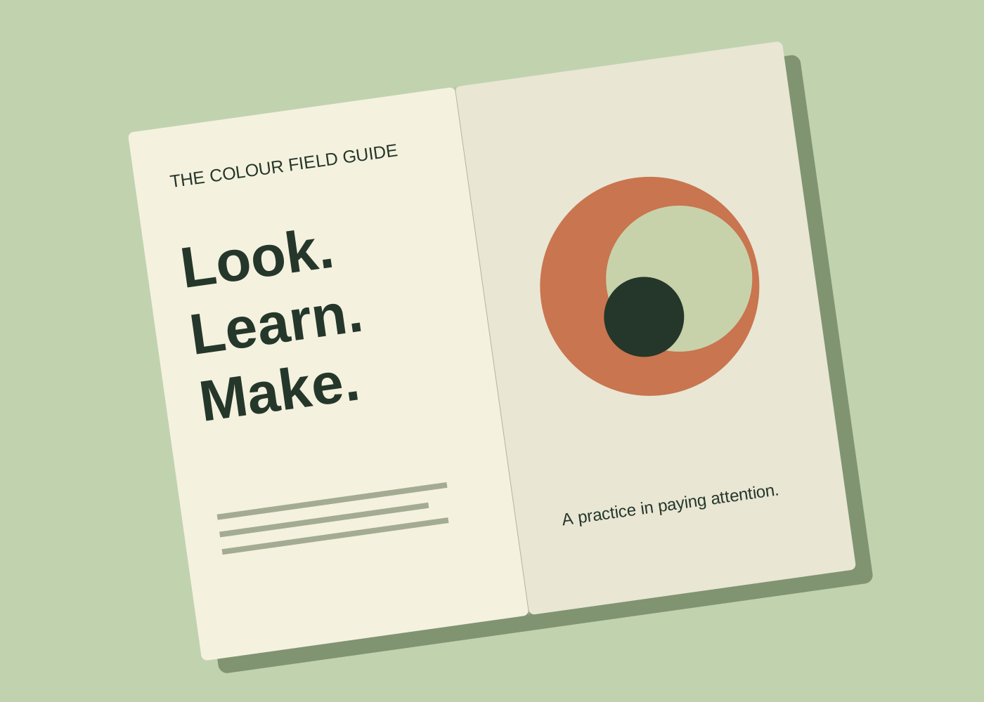
A guide worth keeping open.
Colour is a relationship. A shade that feels clear on a pale background can disappear against a dark one. Begin with the text, controls and information that people need, then build your palette around them.
This page has a passport. Jetskibay reads it to build the catalogue.
View publication manifest ↗Publisher status ↗